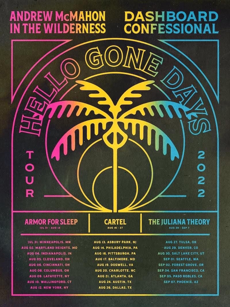
I came across this flyer for a concert, which has different openers for different dates. Each opener lists the dates that they’re playing: Armor for Sleep opens July 31-Aug 14, Cartel Aug 16-27, and The Juliana Theory Aug 28-Sept 7.
Visually, this flyer isn’t bad but it is very poorly designed in regards to user experience. While the dates are listed below the openers, the position and color of the tour dates contradict this information. Based on the dates listed for bands, the shows for Asbury Park NJ and Philadelphia have Armor for Sleep as the opener, but on the flyer, they’re colorized and aligned with the band Cartel. The Tulsa show is a date that Cartel is playing, but it’s listed in the same column and color as Juliana Theory:
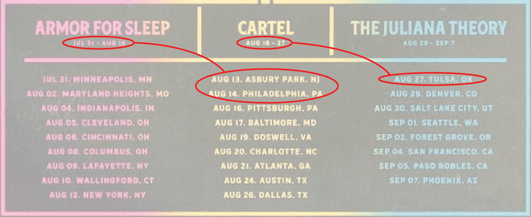
What most likely happened here was that the designer was thinking visually, but not functionally. They likely arranged the columns to have similar number of lines so that it’s visually more balanced. But as noted above, this created some conflicting information to the user. I’m sure if the designer explored other ways to organize the information, they could have found a solution that both looked balanced visually and conveyed the information clearly.