 A great example of attention to detail.
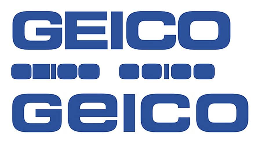
Via Jim Watson:
This logo wants to be symmetrical – a letterstroke in the middle with 2 massive letters on each side. But, the two sides are not quite the same. The version at the bottom is better – the e now better matches the G C O with rounded corners. The symmetry, unity, and consistency of the masses is improved and the kerning between the letters is more comfortable – more breathing room and better respect for the letterstrokes and the counters.