…should reconsider their new logo design.
Arby’s recently updated their logo for the first time in almost four decades. A logo is a company’s identity and what helps a company distinguish itself from other brands. A logo should be memorable, distinctive, and appropriate to the company’s purpose and target audience.
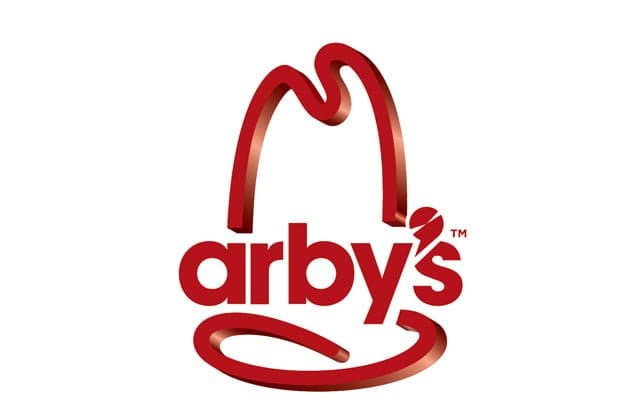
The new logo has several issues:
•Will easily be outdated: A good logo will last over time. The new Arby’s logo is restricted to current trends and in several years will likely be dated.
•Unnecessary visual elements: Only one barb is needed. There should be a strong element that attracts the viewer’s eye and is memorable. If a logo utilizes more than one barb, they often fight for attention and create tension within the logo. In this case, there is the hat and the slicer-appostrophe (I think it’s supposed to be a slicer, anyway). The apostrophe is minimal and is overshadowed by the hat, so it really isn’t necessary. It could have simply been left unaltered (without the white streaks) and the logo wouldn’t have lost anything.
•Poor relationship between type and image: The 3-d hat does not relate to the 2-d typeface. Also, the modern typeface doesn’t pair well with the older southwest-style hat. Imagine wearing an old western cowboy hat with an 80’s jumpsuit. I actually posted a blog months ago with a “typographic puzzle” where one matches shoes with the typeface that fits them.
Here are what some other designers are saying about the new logo:
Bloomberg Businessweek asks four design professionals—99designs’lead visual designer Kyle Lin, Little Red House’s design partner Michelle Gamble, Rivington Design House’screative director Brion Isaacs, and Pratt Institute’sGraduate Communications Design Department adjunct professor Graham Hanson—what they think about Arby’s new, digital-looking logo:
Kyle Lin: Overall, I think it’s a vast improvement from the “before” logo. It has youthful, casual appeal. I like how they brought in modernized aspects of their older branding in updated ways. The new apostrophe’s supposed to represent a meat-cutting blade, which works well with their new positioning. Gotta love the hat.
Michelle Gamble: The old logo had charm and familiarity. This lacks charisma. The hat tries too hard to be an app and has no relationship to the logotype, apart from color. Without the name recognition, the logo evokes more of a “tech” feeling.
Brion Isaacs: The 3D effect has no place in this logo and looks forced and is executed poorly. Sucks. It seems like Arby’s is trying too hard. The whole glossy thing is so out of touch. There’s this retro throwback now, which is kind of cool. The old logo was familiar and classic; it’s a nice piece of Americana.
Graham Hanson: The typography of the old logo evoked Western themes and consequently “paid off” the stylized and simplified cowboy hat/lasso. Now you have what are really abstract shapes with typography that provides no visual cues. The unique essence of what set Arby’s apart from other fast food has been lost.
http://www.businessweek.com/articles/2012-10-04/what-do-pro-designers-think-of-arbys-new-logo