
One of the very first lessons I was taught in typography class was to refrain from stretching or skewing type. Typeface designers spend hours tweaking various strokes, the x-height, the ascenders and descenders, the angle of the stems and spines, etc. so that the font family is consistent and all aspects of the letterforms relate well. Stretched type counteracts all of this hard work. The stroke thicknesses and curvatures become disproportionate, angles change, and inconsistent characters are a result.
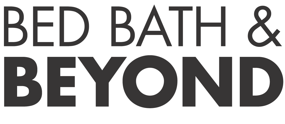
Apparently Bed Bath & Beyond’s logo designer slept through the lecture on type crimes. The logo uses the futura font, which already has a large em space, then horizontally stretches the word “BEYOND”, which creates awkward variations of letter widths.
It appears the creator was trying to emphasize “beyooooond”, but there are ways to do so without resorting to egregious typography. The concept itself is trite. A great logo conveys a strong message about the company and often conveys a feeling or idea, rather than a literal image of the product or name. A great example one of my former college professors uses is insurance companies. Rather than showing a paper policy form, it is more prudent for an insurance company to convey professionalism, trust, and integrity. Emphasizing “beyond” does not convey an idea one attributes to the company and the only feeling it incites is nausea amongst typography lovers such as myself.
Below is what the logo would look like without the stretched typeface, which still doesn’t convey a unique quality of the company, but at least won’t make me wish I were blind each time I drive past an outlet mall.
Comments are closed.