Client: RediBin Art Director: Jason Keisling Designer: Jason Keisling
RediBin is a modern, on-demand storage service that allows customers to store bins of their belongings and have them delivered whenever needed. The company needed a strong brand identity and an intuitive app to convey its convenience, security, and reliability while standing out in the market.
Primary Target Audiences
Urban Dwellers & Apartment Renters
Many city residents have limited space and need an accessible, affordable way to store seasonal items and other possessions without committing to a full storage unit.
Frequent Travelers & Remote Workers
Digital nomads and professionals who move often benefit from a service that allows them to store and retrieve their belongings from anywhere with minimal hassle.
College Students
Students often face temporary storage challenges due to frequent transitions between dorms, apartments, and home during summer breaks or study abroad programs.
Market Research & Brand Strategy
Consumer Behavior Trends
Research showed that consumers prioritize convenience, transparency, and digital accessibility in service-based industries such as transportation, food delivery, and retail.
Pain Points Addressed
Traditional self-storage inconveniently require customers to visit a facility.
Many storage options have rigid contracts and hidden fees.
Competitive Differentiation
Unlike traditional storage units, RediBin offers on-demand delivery and pickup and an easy-to-use digital interface that allows users to track and request items whenever needed.
Brand Voice
Redibin is clear, friendly, and solution-focused. The brand voice is straightforward and helpful, with an innovative, modern approach to making storage easy.
Visual Identity
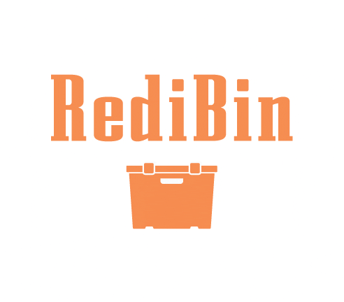
I developed a bold yet approachable brand identity, ensuring RediBin felt modern, trustworthy, and easy to use. The logo design features a thick typeface to convey sturdiness, paired with a complementary color scheme that reinforces trust and reliability. To create a connection between the logomark and typography, I incorporated design elements created by the bin’s latches and handle into the counterforms of the lettering.
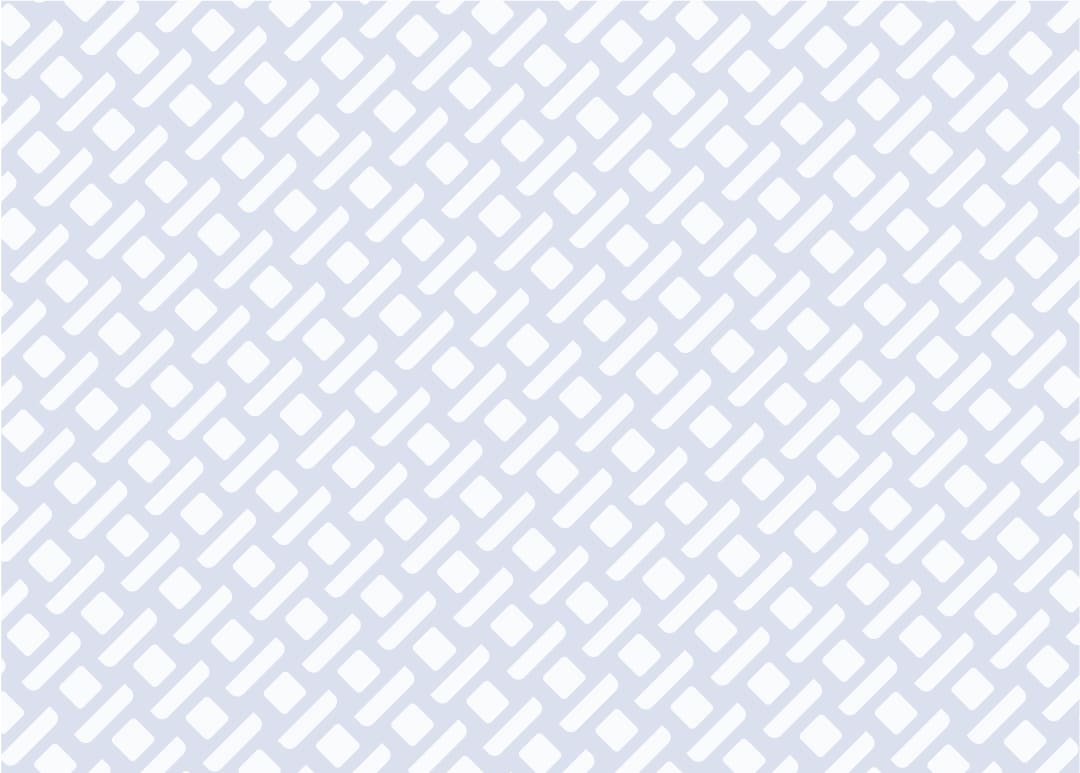
The shapes from the bin (highlighted in black for demonstration) are integrated into the counterforms and the dots over the “i”s in the typeface. These elements are also used to create a cohesive pattern for the brand.
Mockups
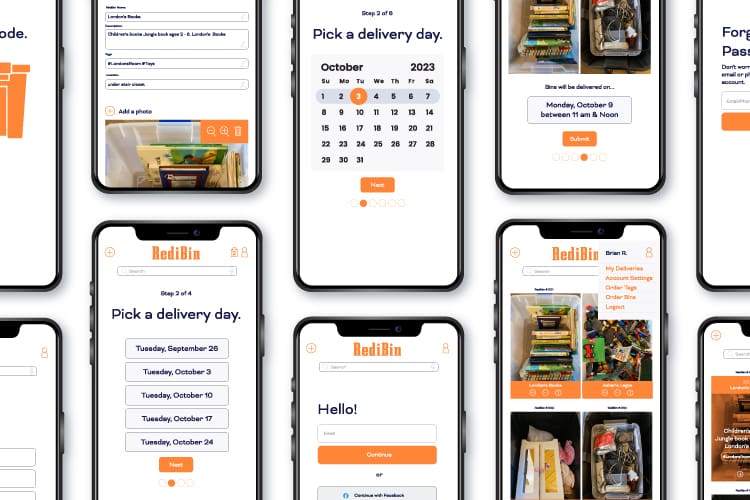
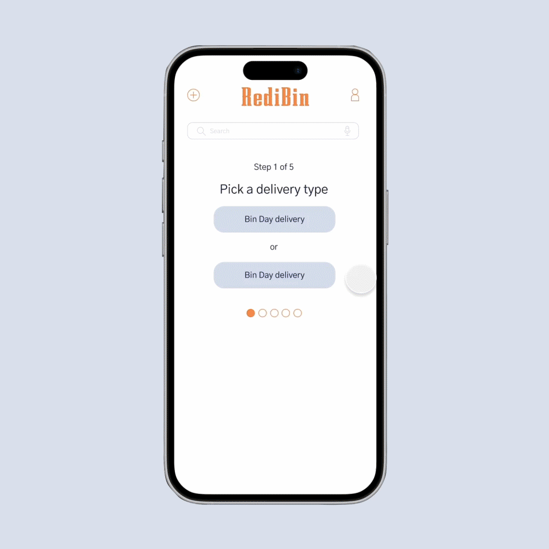
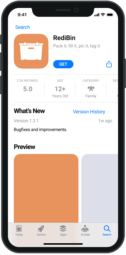
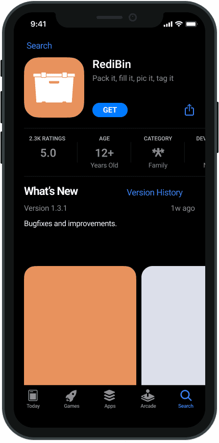
App Design & Prototype
The app is designed for a smooth, hassle-free experience with intuitive navigation and clear calls to action. From signing up and scheduling pickups to managing stored items and requesting deliveries, every step is straightforward and efficient. I designed over 50 screens to cover the entire user journey.
